 |
Uegor is a roundel compact linear sans apt for headline, editorial, branding, packaging, printed materials and typographic applications. 150+ glyphs with ligatures and fractions provided in opentype .otf and .woff format.
| |
Uegor is a roundel compact linear sans apt for headline, editorial, branding, packaging, printed materials and typographic applications. 150+ glyphs with ligatures and fractions provided in opentype .otf and .woff format.


Nomina is a family of sans serif fonts for use from large to small sizes. The weights of the family itself contain 16 styles plus italic, ranging from ExtraLight to Black. The font family takes was inspired by classic Grotesk typefaces such as Venus and Akziden Grotesk. Unlike any other modern Grotesk typefaces, the details of the contrast in this font family are quite subtle and yet still harmonize while standing in between another character, the open apertures help them to increase the quirkiness accompanied by the sharp terminals on each rounded glyphs. The Nomina family is well equipped with lots of selective alternates and OpenType features, and the main usage of this font is universal, this means this can use it any design style as long as the look and feel keep match with its characteristics.


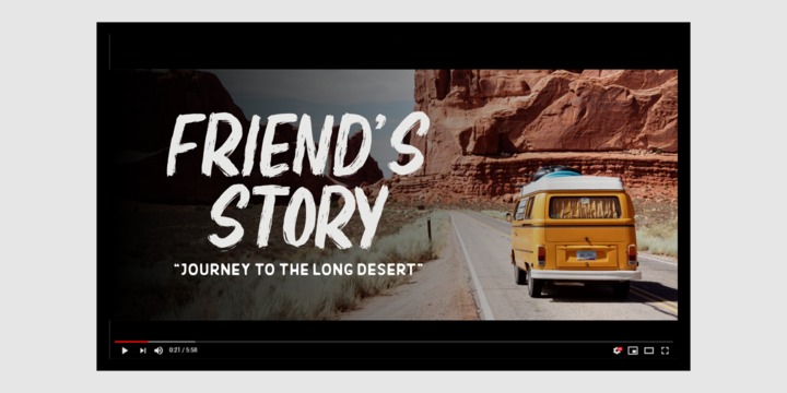
Stange is a font with a futuristic edge, geometric corners, perfect for technology theme. As with its Stange, Stange makes a strong impression in print, headlines, video, and social media – whether paired with a contrasting typeface or on its own.


Quarkwell™ by The Typeworks is a line based typeface ideal for use in designs that require a modern and highly legible appearance whilst still retaining a classic feel.
The Quarkwell font family is inspired by lettering from twentieth-century pantograph engraving machines. The letterforms give a nod to the signature copy sets used on many computer mechanical keyboard keycaps and vintage typewriters, plotter engraved plastics signage fonts and others using modified Gorton lettering.
Quarkwell font faces include many stylistic alternates for its uppercase and symbols characters sets. Need a different "Q" design? Use access all alternates or insert symbol to select a different "Q" form!
Vector lines for plotting machines are also available to purchase on request at TheTypeworks.com
So take Quarkwell home today! It's a perfect fit for all sorts of projects.


Grafical Family set:
Total 20 styles
8 upright, 8 italics (ExtraLight - Black)
+ Regular Outline, Bold Outline upright Italic
Variable:
Variable Roman + Variable Italic
Grafical is a modern Geometric Grotesk sans serif, Developed with geometric forms that have been optically corrected for better legibility. The completely family comes with Extra Light to Black and its matching italic, Designed from elementary shapes and brings simplicity modernist and neutral typeface.
Grafical alternate stylistic set bring futurist display look, With over 752 Glyphs Grafical is support cross OpenType features such as: Stylistic alternate SS.01, SS.02, SS.03, SS.04, SS.05 ligatures, dlig, fractions, case-Tabular Numbers, Oldstyle Numbers, Sub/Superscript Math, sensitive forms, superscripts, subscripts etc.
Grafical PERFECT tool for a range of uses for web, print, motion graphics etc.
Languages Support: Afrikaans, Albanian, Arapaho, Alsatian, Aragonese, Aromanian, Arrernte, Asturian, Asu, Aymara, Basque, Belarusian (lacinka), Bislama, Bemba-lang., Bena, Bokmål, Bosnian, Breton, Catalan, Cebuano, Chamorro, Cheyenne, Cimbrian, Corsican, Chichewa (nyanja), Croatian, Czech, Danish, Demo, Dutch, English, Esperanto, Estonian, Faroese, Finnish, French, French (creole), Frisian, Fijian, Friulian, Galician, German, Genoese, Gilbertese, Greenlandic, Gusii-lang., Hungarian, Haitian (creole), Hawaiian, Hiligaynon, Hmong, Hopi, Icelandic, Italian, Ibanag, Iloko (ilokano), Indonesian, Interglossa (glosa), Interlingua, Irish (gaelic), Istro-romanian, Jerriais, Kashubian, Kurdish (kurmanji), Latinbasic, Latvian, Lithuanian, Ladin, Lojban, Lombard, Low (saxon), Luxembourgeois, Malagasy, Makonde, Maltese, Malay (latinized), Manx, Māori, Megleno (romanian), Mohawk, Morisyen, Norwegian, Nahuatl, Norfolk (pitcairnese), Northern (sotho), North-Ndebele-lang., Occitan, Oromo, Pare, Polish, Portuguese, Pangasinan, Papiamento, Piedmontese, Potawatomi, Quechua, Romanian, Rhaeto-romance, Romansh, Rombo, Rotokas, Rukiga, Rundi, Rwa, Rwandan, Sami (lule), Samoan, Serbian, Slovak, Slovenian, Spanish, Sardinian, Scots (gaelic), Sena, Seychelles (creole), Shona, Sicilian, Somali, Soga, Southern (ndebele), Southern (sotho), Swahili, Swati (swazi), Turkish, Tagalog (filipino), Taita, Tahitian, Tausug, Teso, Tetum, Tok (pisin), Tongan, Tswana, Turkmen (latinized), Tuvaluan, Ubasic, Uyghur (latinized), Volapuk, Veps, Votic (latinized), Vunjo, Walliser German, Walloon, Warlpiri, Xhosa, Yapese, Zulu
2021 Copyright © Letter Omega Typefaces All rights reserved.


Resist Sans is a free-spirited neo-grotesque that embodies both the innate desire for revolt and a tendency towards uniformity. While Resist Sans preserves the neat, minimalist look which is associated with neo-grotesques, it also accentuates the tentativeness of each letter form. The name, too, hints at the rebellious character of the typeface. Resist Sans comes in 20 styles (10 uprights and matching obliques).
Text vs Display
Resist Sans comes in two versions: Display and Text, which serve different purposes but remain interchangeable and even complementary in some cases. Resist Text is equipped with deep ink traps and optical compensators, which really come into play at smaller sizes. Certain glyphs (such as 'f', 't' and 'l') are more narrow, which makes larger bodies of text more uniform and solid. The Display version features more contrast, especially when rounder glyphs like 'p' and 'd' are involved. The aforementioned 't', 'f', and 'l' are wider, more idiosyncratic. It's perfect for headlines and logos. However, we also kept the narrower glyphs in Resist Display—they are accessible via Stylistic Alternates (ss01); wider letters can also be accessed in the Text version via the ss01 feature.
Styles/Weights
Each of the two versions of Resist Sans comes in 5 weights (Thin to Bold) and is equipped with matching Obliques, which brings the total number of styles to 20. Two trial styles (Text Light and Display Medium Oblique) can be downloaded free of charge. Each style contains 870+ glyphs, awesome OpenType features, and more than 2500 kerning pairs.
Language Support
Resist Sans is truly multilingual. It supports most European and Latin-languages and features Extended Cyrillic, which gives access to such languages as Russian, Ukrainian, Bulgarian, Serbian, Macedonian and many more.
Free Styles
Two versions of Resist Sans can be downloaded for free on MyFonts.
Type Specimen
Resist Sans PDF Type Specimen can be downloaded here: Resistance Sans PDF Type Specimen


The Novera family is a sharp geometric sans in ten weights plus matching italics, available in two versions – Modern and Classic. It has a contemporary, approachable and multifunctional yet characteristic design, that comes with an extensive glyphs set of 1000+ glyphs per font, meeting all typographic demands.
The Design
Vertical terminals, circular shapes and angular apexes – Novera truely breathes geometry! But the concept goes beyond the application of rational geometry. The intension was to create a highly legible family suitable for every day usage inspired by the work of Paul Renner, Eric Gill or Jakob Erbar, combining the geometric with the human and the functional with the unconventional. Although Novera is inspired by the past, its appearance is unmistakingly modern.
Modern vs Classic
Novera is available in two versions - Modern and Classic - born from the same source file but with different characters set as default. This creates subtle but effective distinctions such as the double-storey a (Novera Modern) which is optimized for legibility in longer text paragraphs, as opposed to the single-storey a (Novera Classic) which allows a purely geometric appearance.
Another distinguishing feature are the ascenders on Novera Mondern, which extend above the cap height for an elegant presence, compared to the ascenders on Novera Classic, ending at the cap height, for a compact and helvetica-flavored look.
Novera Modern was intended for usage in body copy, whereas Novera Classic was planned for headlines, short paragraphs or logos, but both versions can be used vice versa too, of course.
Alternate Characters
To maintain neutrality and a modern appearance, the standard character set largely dispenses with idiosyncratic forms. This is in contrast to the alternative forms with the gill-like lowercase letters g and t as well as a traditional shape of S and the German ligature t/z, which traces back to old German spellings. Also inspired by German poster designs from the early 20th century are the elongated i-dots and dieresis-dots that can create eye-catchers in headlines or logos. By the way, both versions, Novera Modern and Classic, can be created via stylistic set 1, 17 and 18.
Opentype Features and Symbols
The family comes with many opentype features to support modern typesetting. This includes ligatures, different number sets or alternative shapes for texts set in all caps.
If you like arrows and other shapes, you will love Novera! The family has a built-in extensive symbols-set including 48 different arrows and various geometric shapes or icons.
Weights
With its 40 styles and 1000+ glyphs per font, the Novera family covers all thinkable design scenarios from branding to web, app or editorial usage. It blends in perfectly in text heavy paragraphs with its mid-weights like Light, Regular, Medium or Bold or stands out like a monument in headlines and posters with its extreme weights like Thin, ExtraLight, Black or Ultra.
Testfonts
If you like to test the fonts before buying the full version, please follow the link below. Please note, all test fonts are available for evaluation purposes only and contain a limited character set! A commercial license for the full version must be purchased separately. Please send a mail to contact@renebieder.com for more information.
Download the test fonts here: https://www.renebieder.com/test-fonts
 |
Xova Rounded is a geometric rounded typeface. The use of perfect round shapes and quite a low ascender height makes it a very stable, yet playful looking typeface.
 |
 |
| Download Elbrush Fonts Family From Garisman Studio |
 |
 |
| Download AG Bambook Fonts Family From Alexandr Galuzin |


