Showing posts with label ebook. Show all posts

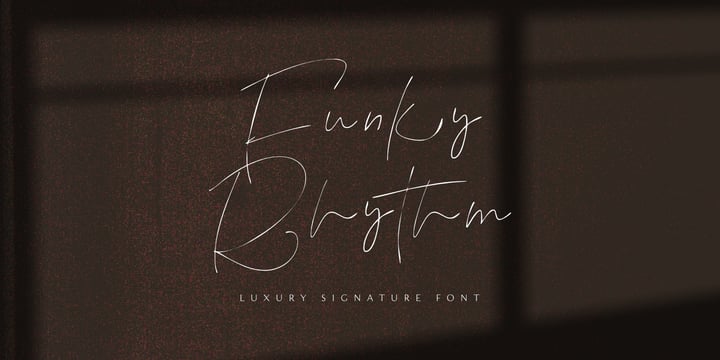
Funky Rhythm fonts from Epiclinez - (saopu)

Funky Rhythm
Funky Rhythm Funky RhythmFunky Rhythm


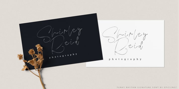
Funky Rhythm is a luxurious signature script font with a natural flow. This font is a good choice for an Instagram post, movie titles, album cover, book/ebook title, YouTube cover, and of course high-end, sophisticated branding design.

So what's included:

  • Basic Latin, numbers, symbols, and punctuations
  • Simple Installations: works on PC & Mac
  • Multilingual Support includes Afrikaans Albanian Catalan Danish Dutch English Estonian Finnish French German Italian Norwegian Portuguese Spanish Swedish Zulu.
  • Accented Characters : ÀÁÂÃÄÅÆÇÈÉÊËÌÍÎÏÑÒÓÔÕÖØŒŠÙÚÛÜŸÝŽàáâãäåæçèéêëìíîïñòóôõöøœšùúûüýÿžß
  • Accessible in Adobe Illustrator, Adobe Photoshop, Adobe InDesign, even works on Microsoft Word
  • PUA Encoded and fully accessible without additional design software

Thank you! We hope you enjoy our font!


Download Bridge Text Font Family From TypeMates

Download Bridge Text Font Family From TypeMates
Download Bridge Text Font Family From TypeMates Download Bridge Text Font Family From TypeMatesDownload Bridge Text Font Family From TypeMates


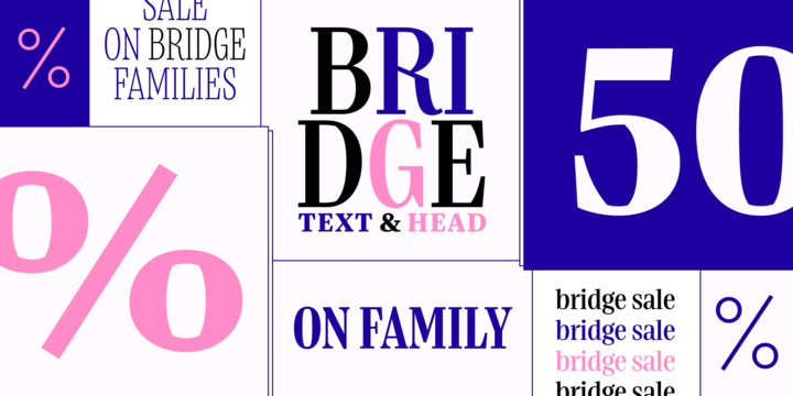
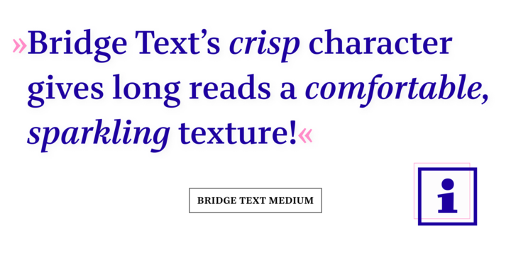
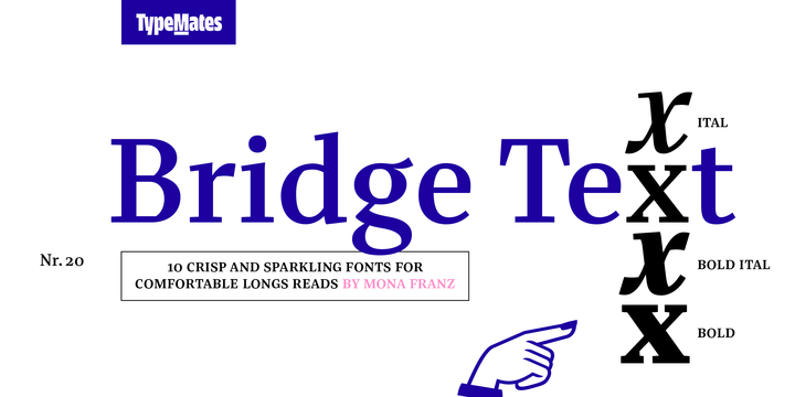
The drummer in a band of confident, edgy editorial typefaces Bridge Text brings rhythm and clarity to longform reading. With crisp character, sparkling texture and driving asymmetrical counters, Bridge Text refines Bridge Head’s graphic qualities for note perfect, highly readable text at smaller sizes. Slightly narrow proportions, moderate stroke contrast and an ample x-height ensure Bridge Text is clear and efficient. With five weights and matching italics for distinctively setting quotes or marginalia, Bridge Text has a range of ways to give longform text a modern voice. Each of her 10 styles can work together with Bridge Head to tell stories and build complex typographic ensembles in editorial and corporate design. Unlike other superfamilies, Bridge Head and Bridge Text are distinguished by more than optical adjustments. Letterforms and details are opened out or simplified for body text. Close up, the two-cornered counter shape that gives text a crisp character appears. Step back, and a smooth, calm texture for print publishing and digital media emerges. The daughter of classical Didone typefaces, Bridge has a vertical stress and a modern treatment. Bridge’s ideas and foundations began during TypeMedia 2018 (https://www.typemedia2018.com/mona) in The Hague as a master project under the supervision of Erik van Blokland, Paul van der Laan, and Peter Verheul. Thank you!


Download Bridge Text Font Family From TypeMatesDownload NowView Gallery